Hero image

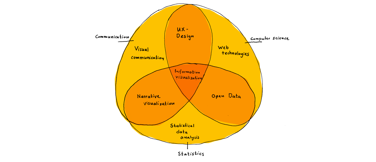
Information Visualization

Big and small visualization projects during my Master's degree  — 

Wind is one the rise. Or is it?
Client

FHNW

Period

2019

Product

Scrollytelling visualization story used for an experiment on how animated transitions between visualizations affect understanding.

Contribution

Data-analysis with Pandas, Data exploration with Vega-Lite, Static visualization design with Sketch, Implementation of the visualization and the animated transitions in JavaScript and d3, Distillation into a framwork to declaratievely build visualizations and animated transitions between them

Links

Energy story

MorphingChart-Framework on Github

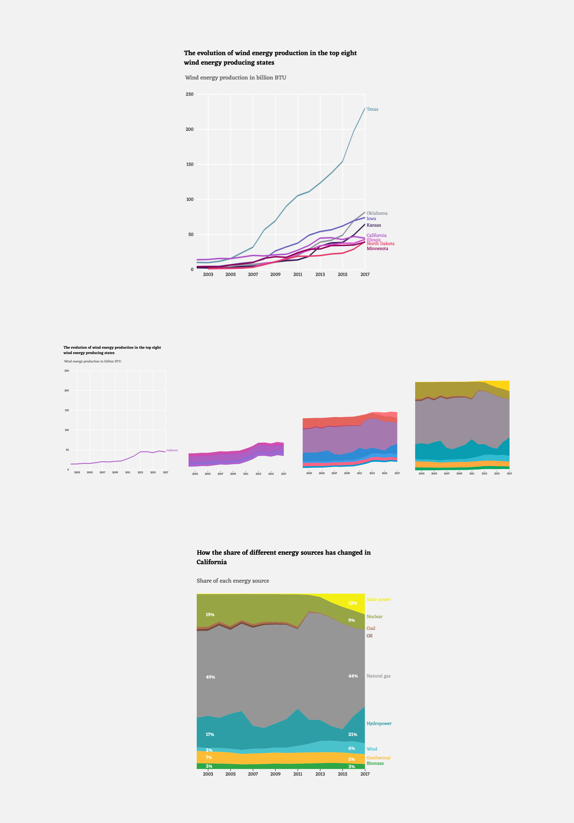
Morphing visualization showing the evolution of wind energy in different states and how the energy mix changed in California

Morphing visualization showing the evolution of wind energy in different states and how the energy mix changed in California.

The series of visualization was created as an experiment. It simulates a typical online newspaper story told only in the form of visualizations. Our intent is to test if readers see stronger links between two visualizations when one is morphed into another compared to a static presentation.

International aid

Client

Enrico Bertini, Storytelling with Data

Period

2019

Product

Explorative visualization of Aiddata.org-data

Contribution

Data-analysis with Pandas, Data exploration with Vega-Lite, Static visualization design with Sketch

Dataset entries

1.5 million

Link

Article

An explorative data visualization showing patterns in the flow of international aid money

Interesting patterns can be found when analyzing the flow of international aid money. For example, there are groups of donors with very similar donation patterns.

An explorative visualization on patterns in international aid. The static visualization was created in response to a «Storytelling with Data»-challenge. Historical events like the Gulf war or the Afghanistan war become apparent in the donation patterns. Also, there are different types of donors and different motivations for donations. Many countries are still very much involved in supporting their ex-colonies for example. This visualization forms the basis for the development of narrative visualizations on international aid.

Full-resolution visualization and project description

The evolution of mortality rates in the U. S.
Client

Fachhochschule Nordwestschweiz

Period

2019

Product

Research project on the effectiveness of animation in narrative visualization

Contribution

Research on animated transitions in visualization, Design and user-testing of animated transitions, Implementation of the interactive with d3 and Typescript

Interactive

Mortality evolution

Repository

Github

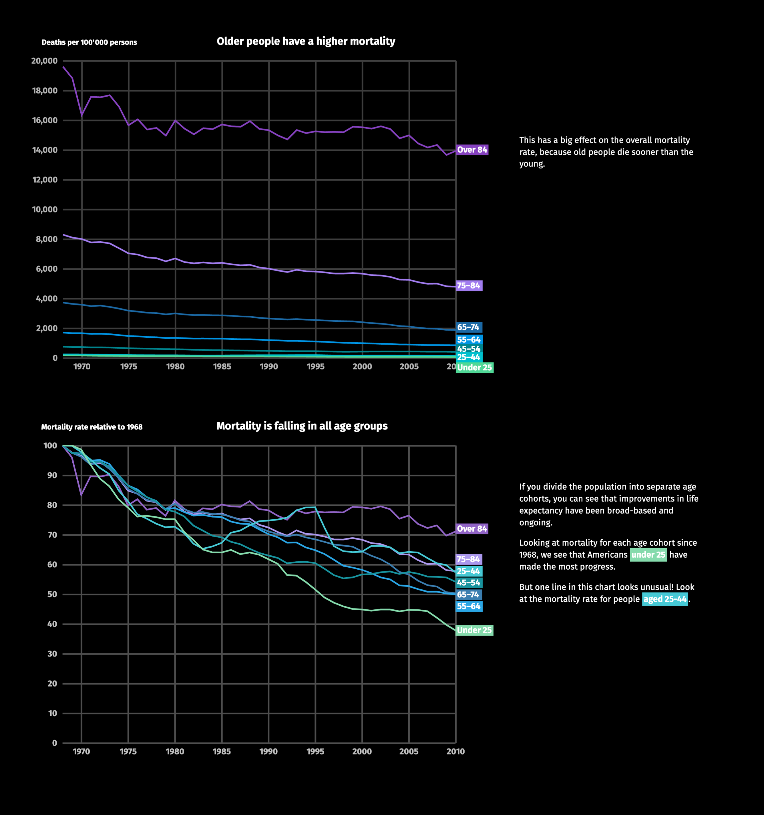
Preview of the mortality story

Screenshot of the interactive story on mortality in the U. S.

This is a redesign of the Bloomberg story «How Americans die». The story is fantastic but the way it was implemented makes it harder to follow than necessary. For our research, we've wanted to test if animated transitions help people understand stories told through visualization better. We started by redesigning the Bloomberg story according to the state of the art in current visualization research.

Try out the interactive

The hitchhiker's guide to Swiss Open Government Data

Client

Opendata.ch, Fachhochschule Nordwestschweiz

Period

2017

Product

Article on the state of Open Data in Switzerland

Contribution

  • Research and interviews
  • Crawler in Python
  • Visualization design in Sketch
  • Implementation in d3
  • Writing the story in Markdown

Repository

Github

Visualizations for the article on the current state of the Open Data movement in Switzerland

Visualizations for the article on the current state of the Open Data movement in Switzerland

The goal of this project was to get an overview of the state of Open Data in Switzerland. On one hand, interviews with activists and data providers were conducted. On the other hand, the datasets on opendata.swiss were investigated. For this, all datasets were downloaded from the platform and analyzed for their size and number of entries. The results of the interviews and the analysis of the platform have been compiled as an article and two interactive visualizations.

The article and the visualizations won the first edition of the «Open Data Student Award» in 2018.

Read the article

What is watt?

Client

Energy Data Hackdays

Period

2018–

Product

Application to raise awareness of personal energy consumption

Contribution

  • Concept on paper
  • Design in Sketch

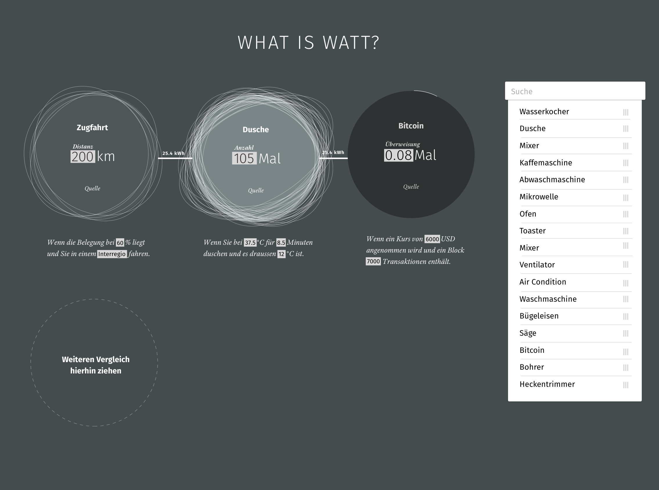
Exploring ones energy use by comparing everything with everything

«What is watt» is a tool to better undestand ones energy consumption. It allows comparing «everything with everything»

The goal of What is Watt is to compare everything with everything. How much energy does my daily train-commute take? (12.8 kWh) How many times can I take one of my famously long hot showers for the same amount of energy? (9 times) Or how many times could I take the elevator for just one floor? (1200 times) In the end, the decision is with each person, if she wants to move closer to her place of work or if she takes a hot shower less often to save energy.

The project is still work in progress and has been great for experimenting with combining traditional interface design with information visualization to create a form of a story-generator.
Read more about the design process